Annabelle Greenway
“Failure is an integral part of your success, learn from it, embrace it and remember to have fun along the way!”
Hey, I am Annabelle!
I'm an experimental designer who loves to push boundaries to come up with innovative solutions to problems. I love information design and innovative, engaging communication strategies. I love using analogue techniques to create my work and combining it with digital processes to deliver exciting outcomes to projects. I thrive off variety and love to continually push myself and the different types of projects that I undertake. I am passionate about sustainability and believe that design can do a lot of good in the world!
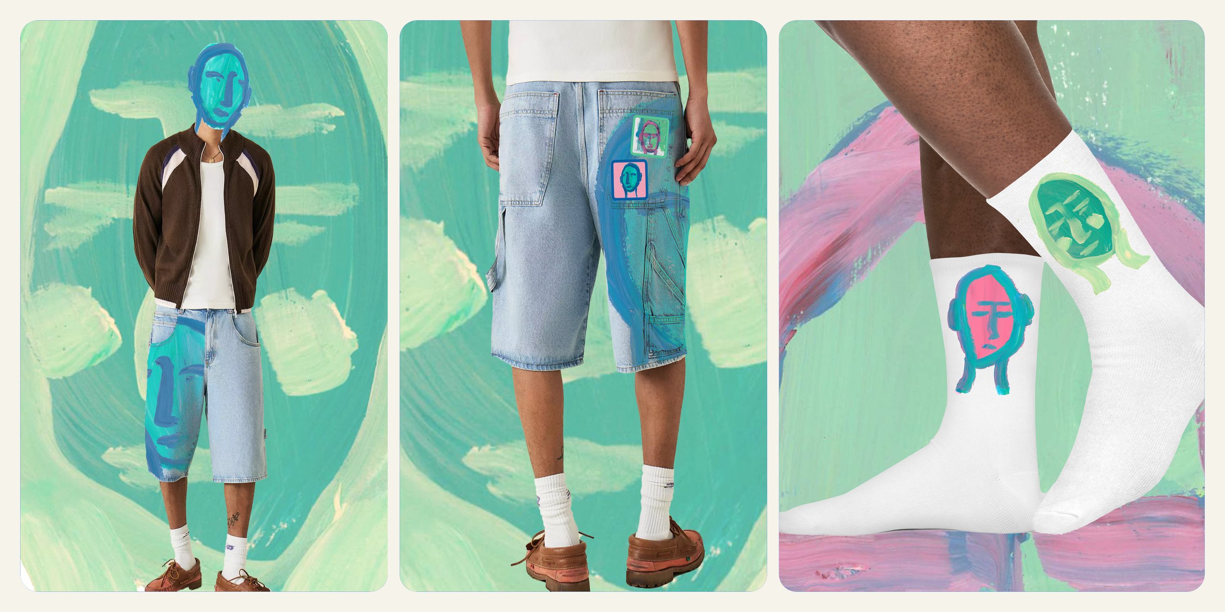
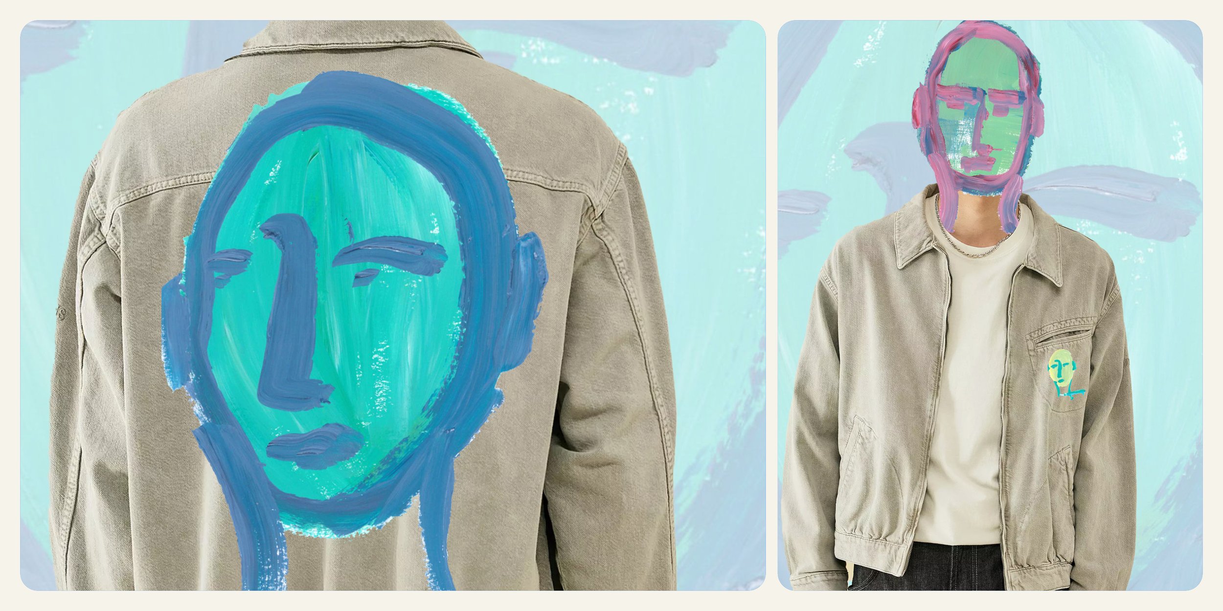
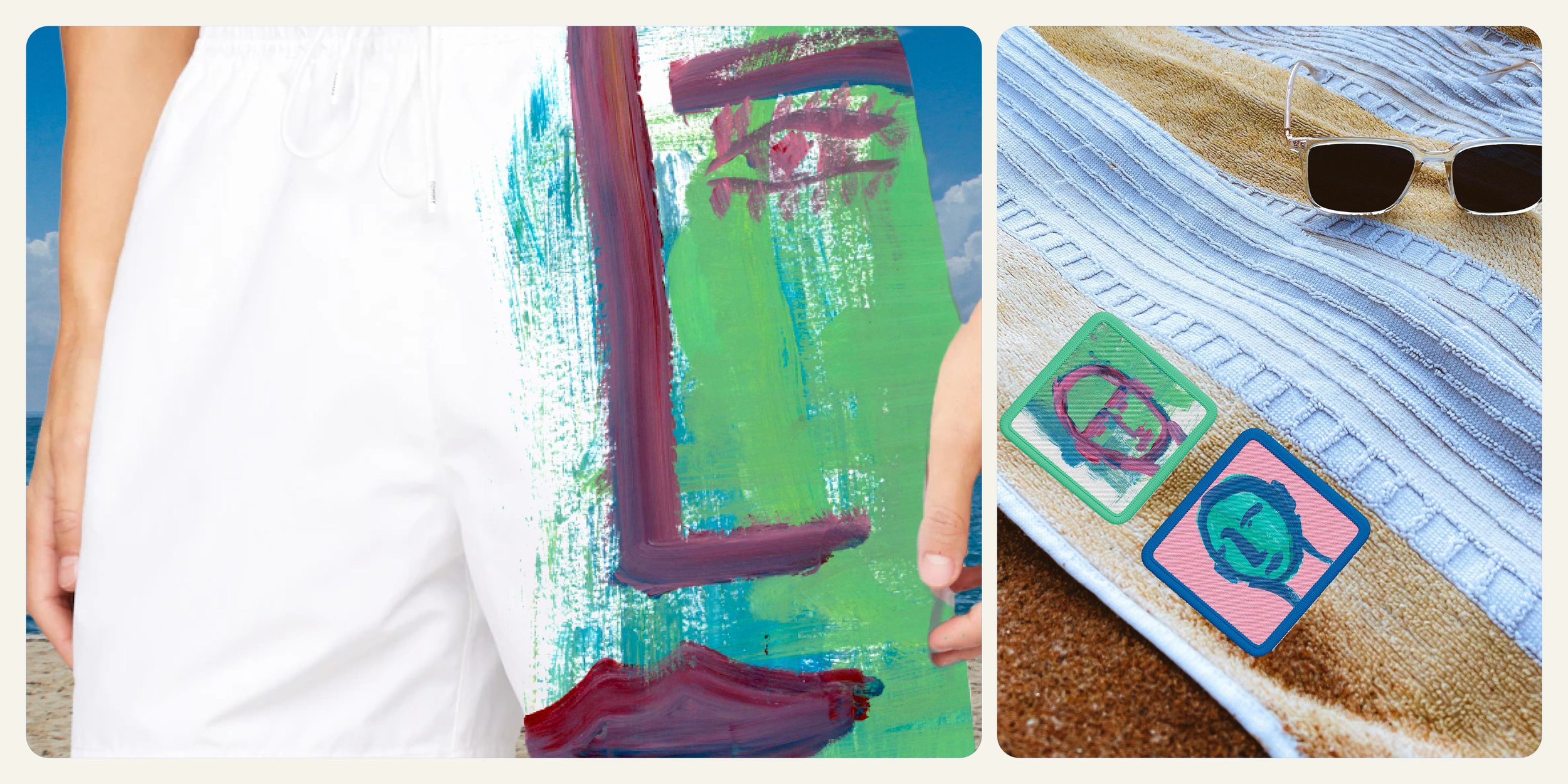
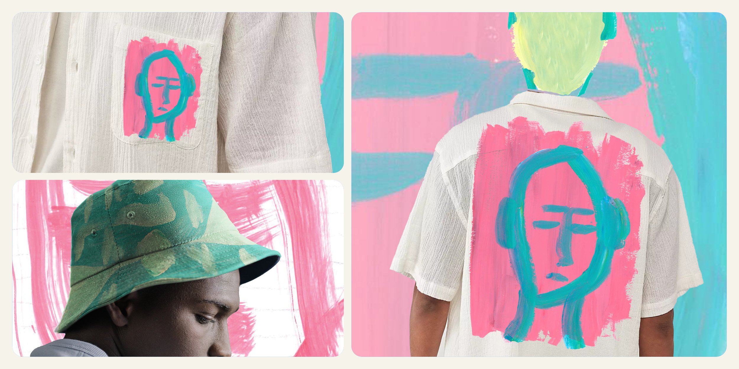
This was a project set by the fashion retailer: Next. We were tasked with creating a set of surface designs for either SS25 or AW25. I chose to do a spring summer collection, which involved lots of fashion trend research, predictions and in depth consumer profiling. I created a collection called ‘Beautiful Mess’ which fitted into a sub-brand I developed for Next called ‘Next Originals’. This sub-brand honours individuality and champions the consumers individuality. It strives to use all recycled and renewable fibres. This collection includes: aqua-reactive swimming shorts, screen printed designs and bold statement pieces which will last the test of time. I pushed the promotion on this project by incorporating AR and motion into my social media strategy.

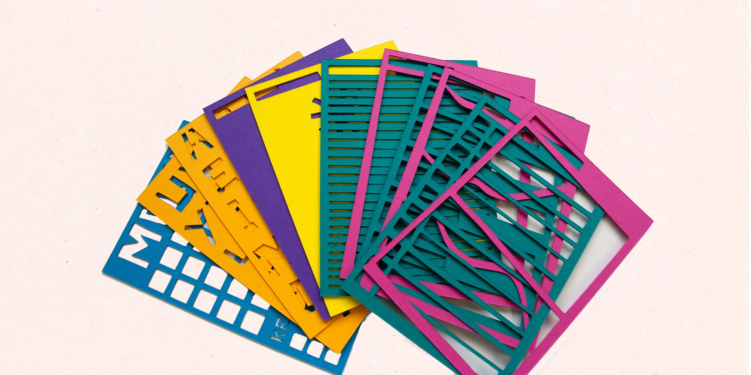
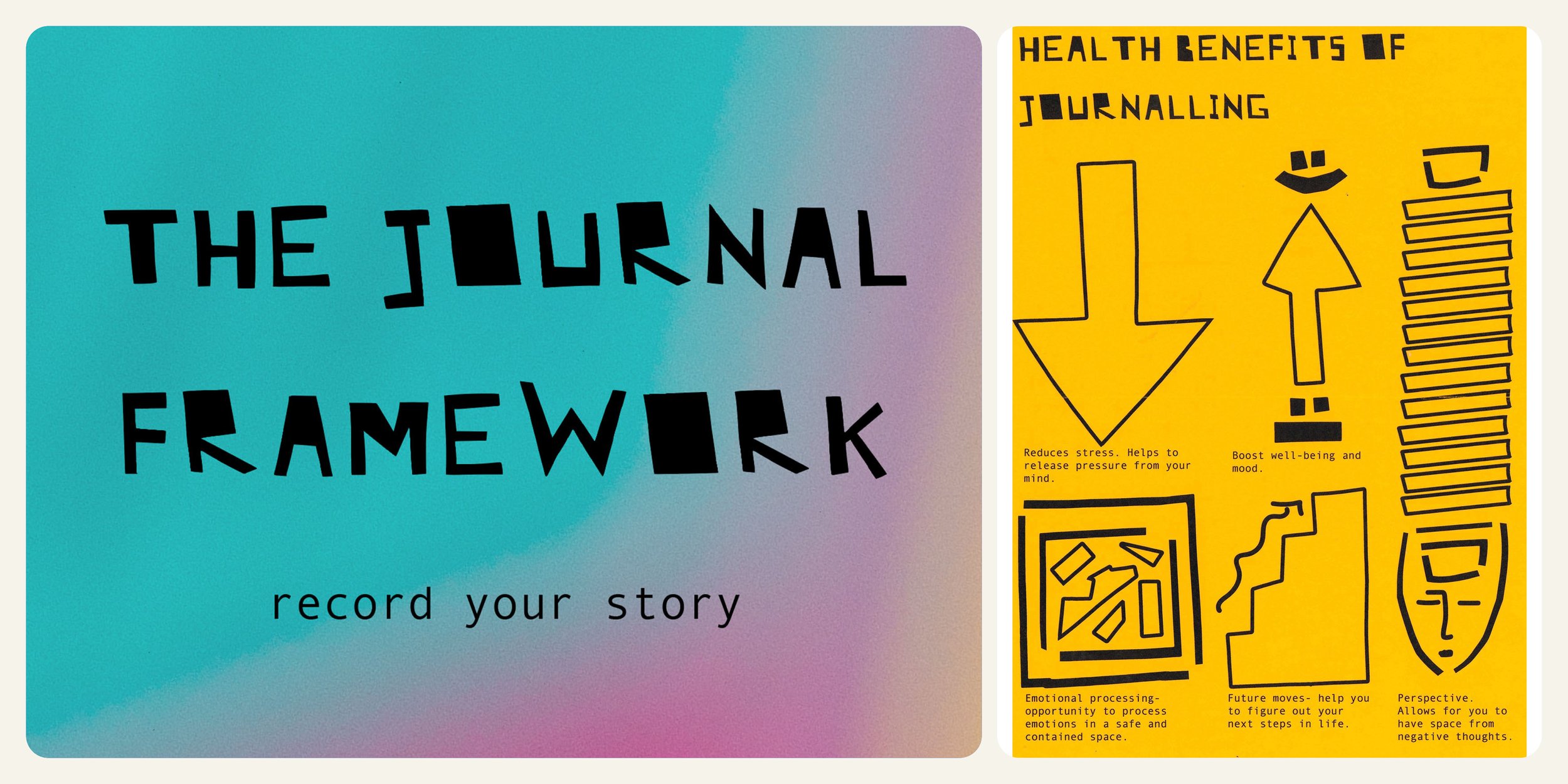
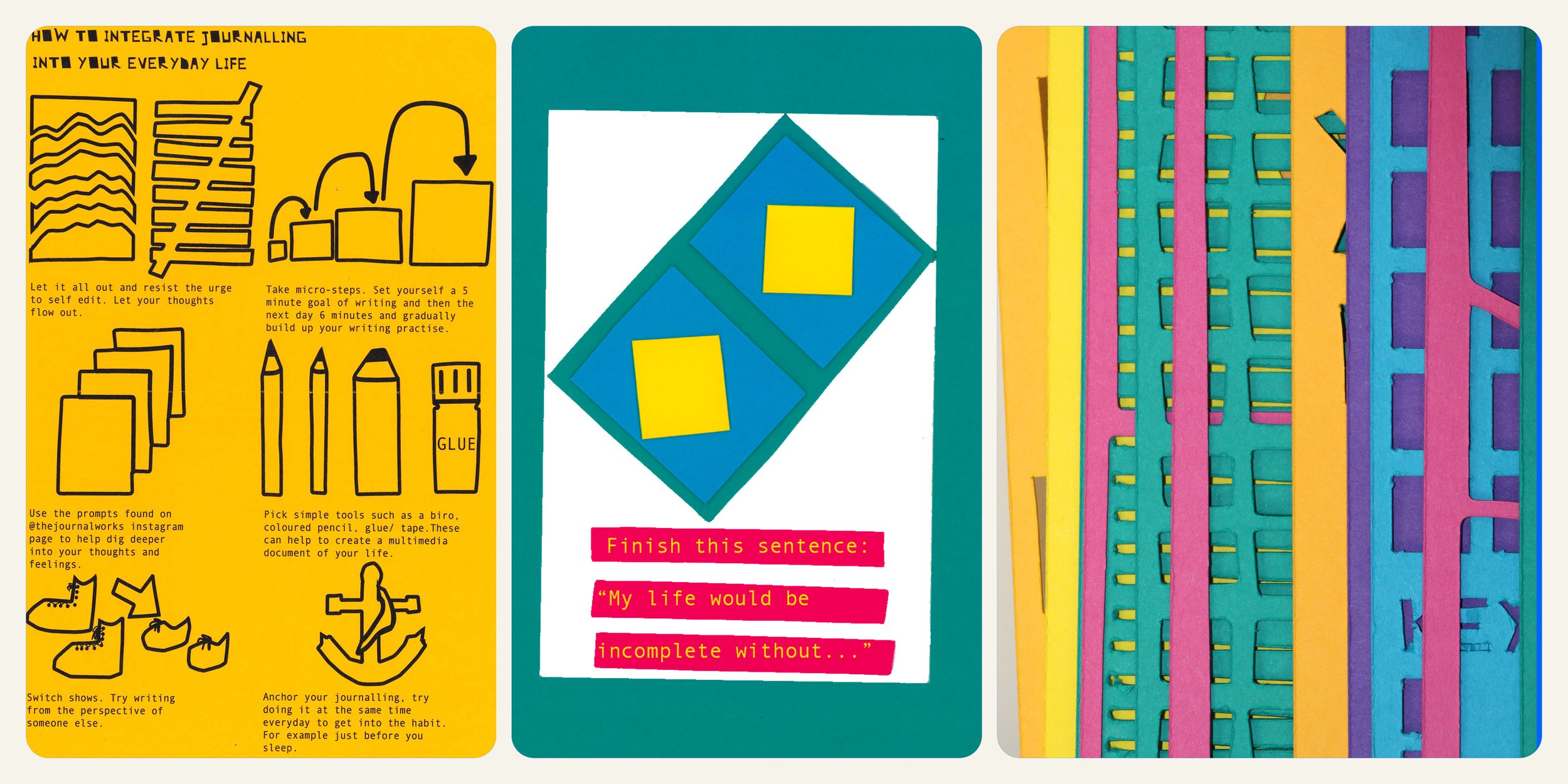
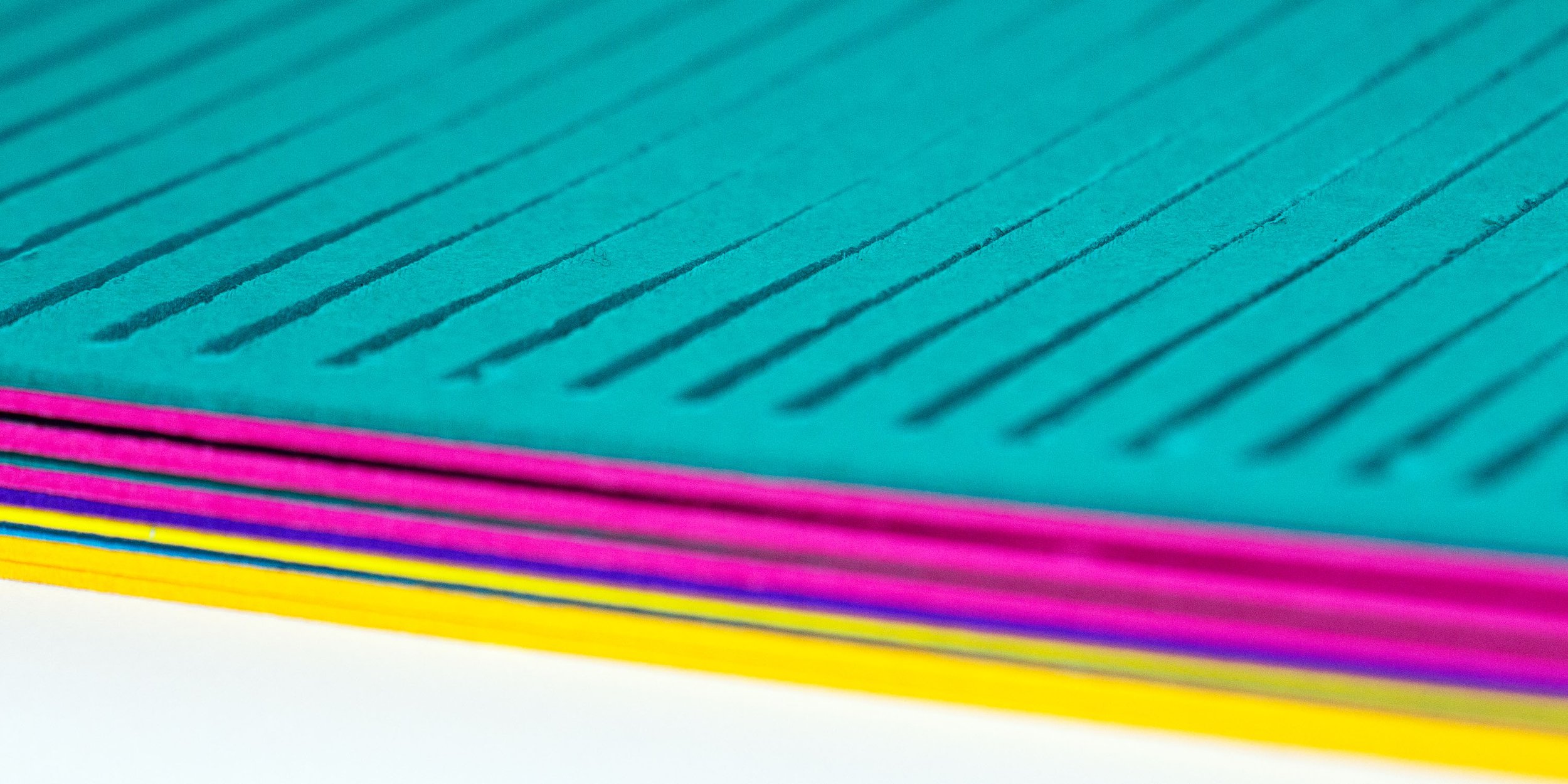
The Journal Framework
The Journal Framework is set of stencils, instructions, information leaflets and an instagram community to help an individual integrate and journal on a regular basis. T.J.F. provides an eco-friendly alternative to prompted journals, as these stencils can be reused and used in different combinations to suit the needs of the individual. The set of stencils also comes with an information leaflet to help the individual with tips on integrating journalling into their life and how to get the most out of the practise. There is a science backed health leaflet with a multitude of benefits to this pastime. The overall look of the stencils stacked on top of one another is a metaphor for the interweaving of thoughts, ideas, emotions and experiences captured in a journal. My own journaling practise which spans across 10 years helped to inform this project on multiple levels.

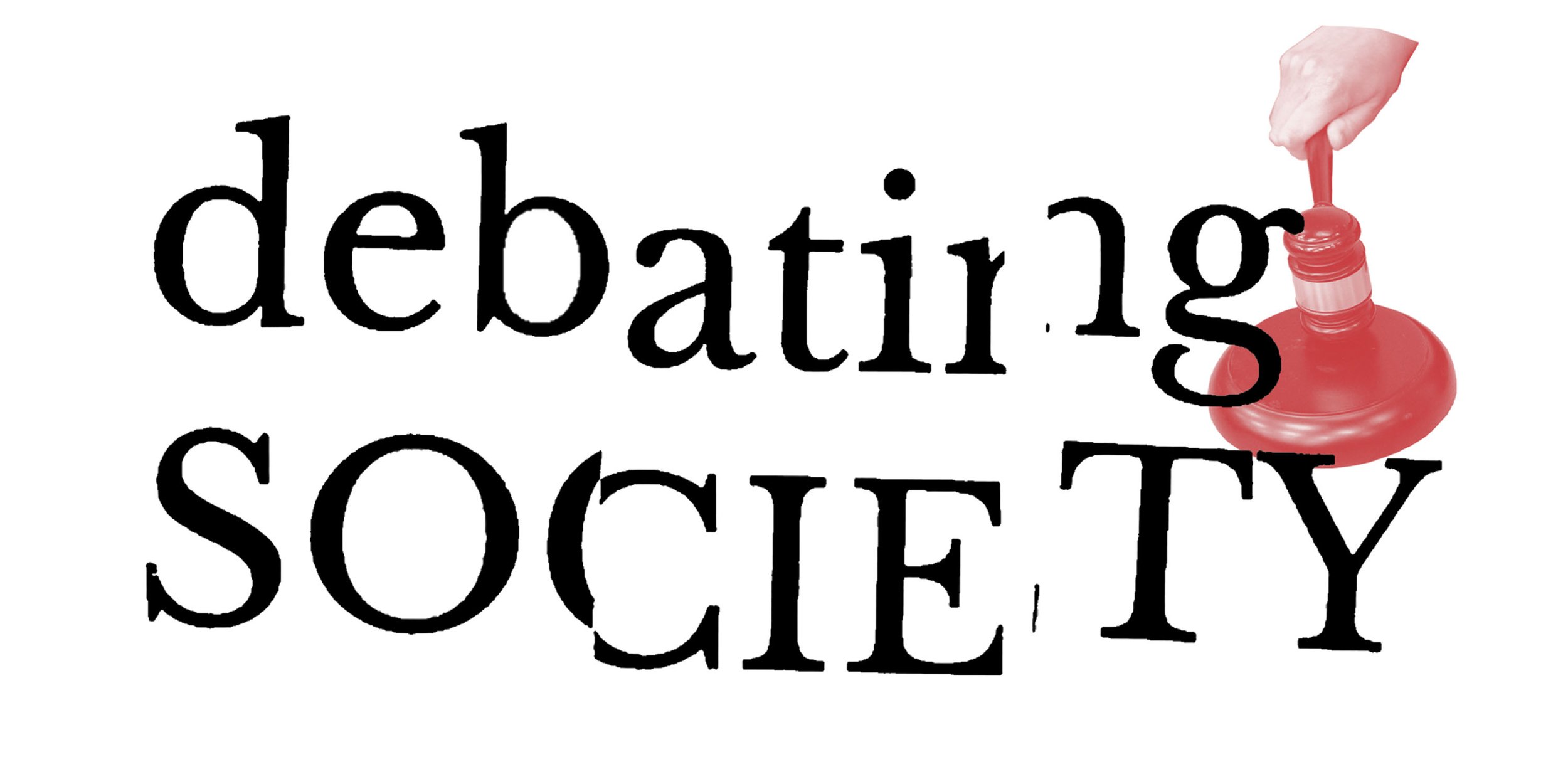
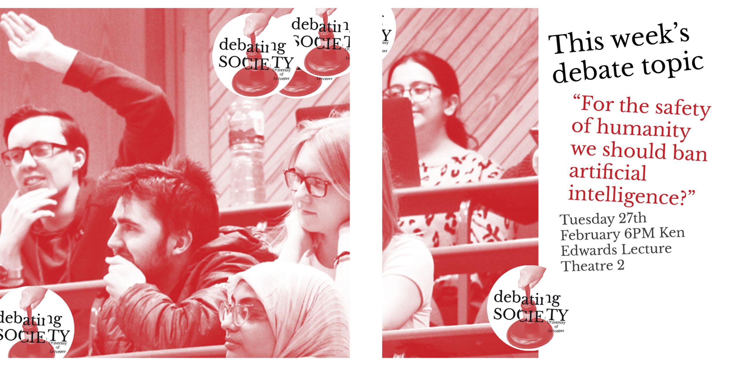
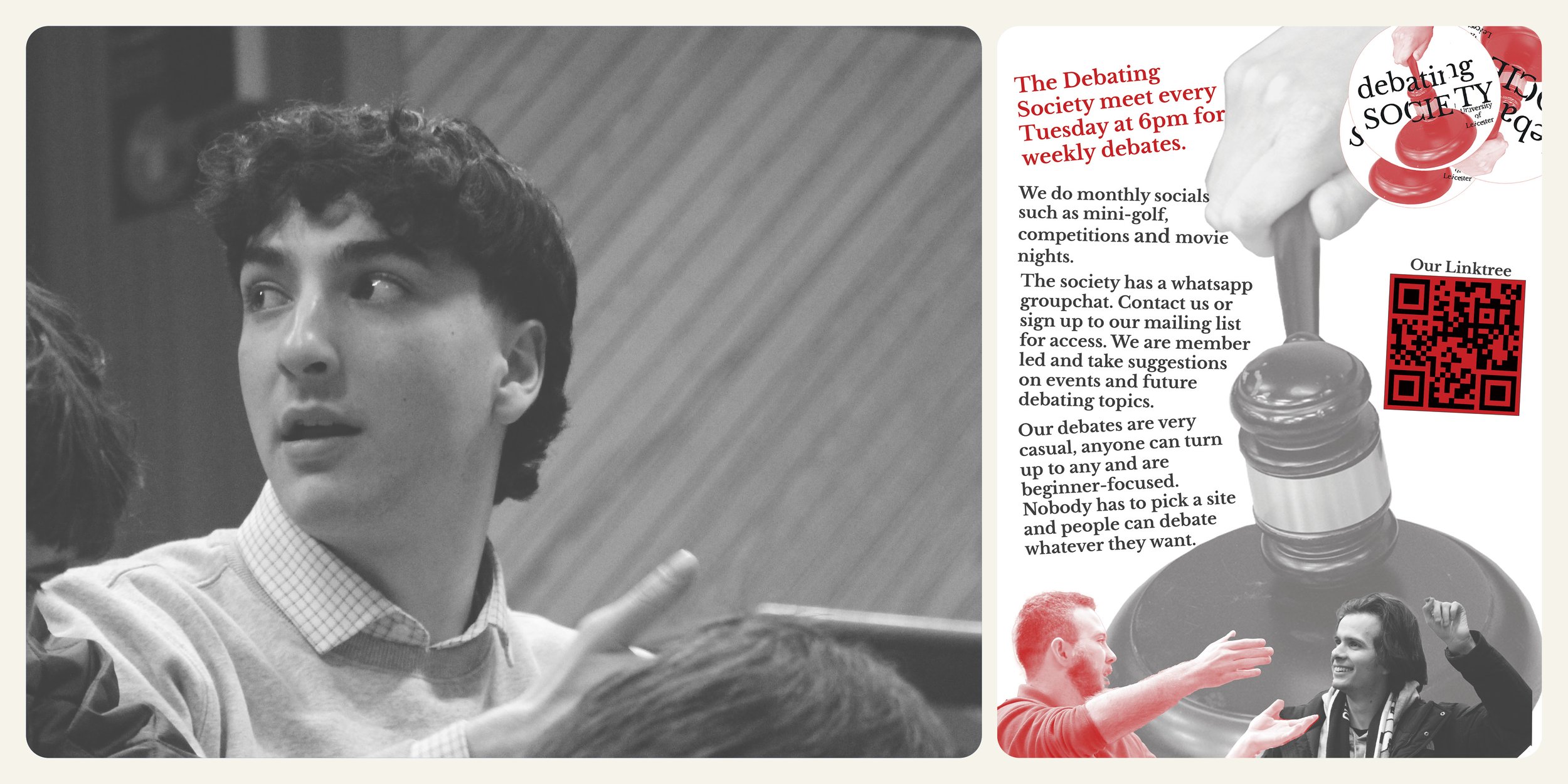
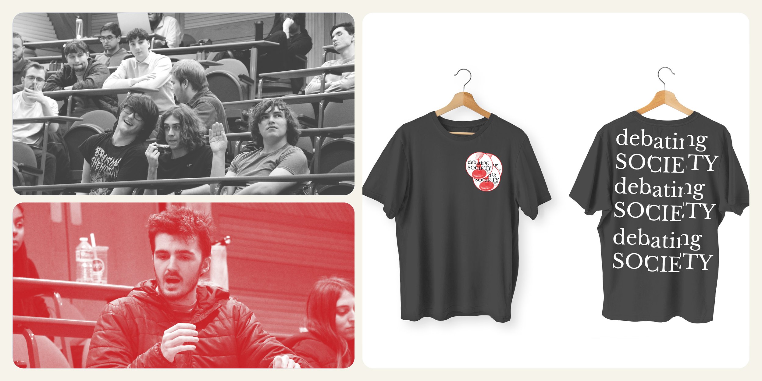
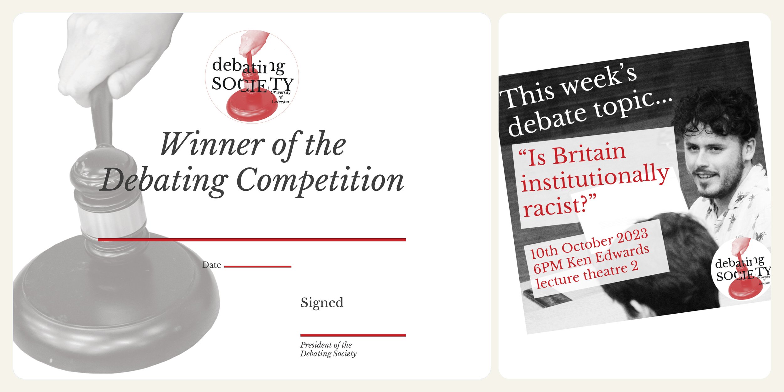
Debating Society
This was a live project I self-initiated with the University of Leicester Debating Society. They wanted a new brand identity, to represent the society and students who attend. I set out by understanding how the society currently do their social media posts. They use Canva to create the posts and they have very limited design experience. So, I created a brief of developing a fresh new identity with templates that can be dropped into Canva and then text can be added easily. I developed a brand guidebook to instruct the society on how best to use the templates and identity. The branding shows off the community spirit of the Debating Society through the use of clear, energetic photography. The typography represents the complexity of these topics and the innovative, boundary pushing ideas to try and come to conclusions in the debates.